HeadroomSIO · Menu Design Studio
Restaurant Menu Design Portfolio
Three menus, three completely different rooms. A white-tablecloth prix fixe, a loud bayou fry-house, and a mid-tier seafood spot — because the work isn’t a house style you paint onto every restaurant. It’s reading the room you’re in, then making the menu do what that room needs.
The Heron Club
a legibility redesign
Real client work, shown anonymized
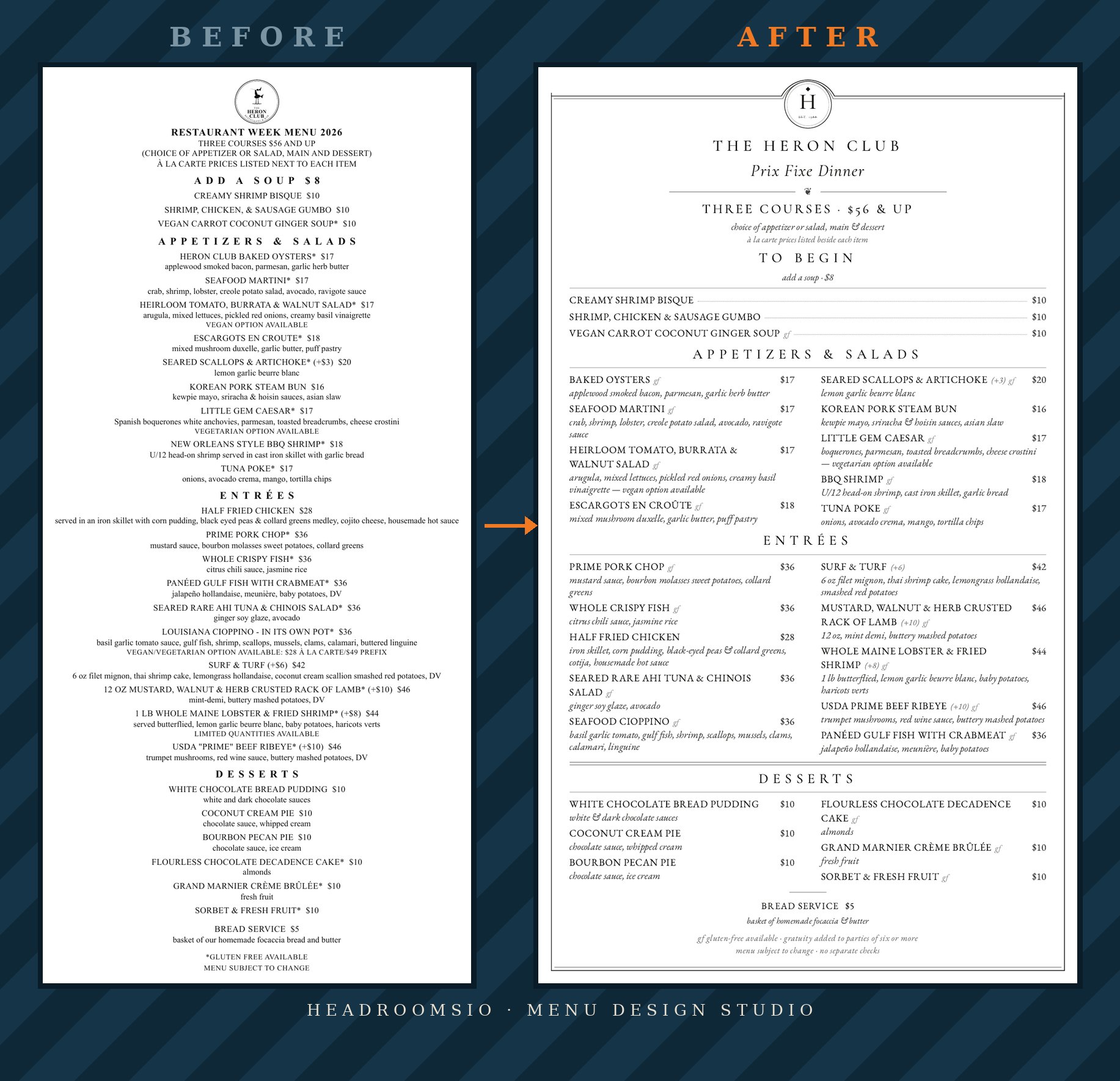
The items didn’t change. The prices didn’t change. This one wasn’t about rebuilding the menu’s guts — it was about making a menu you could actually read. The before was a wall of centered bold text, a dollar sign on every price, courses that ran together and made you hunt.
The after gives it structure. Two columns. Hairline rules between the courses. Descriptions dropped into italic, gluten-free marks made consistent, upsell notes made regular, and every price tucked quietly to the margin instead of shouting mid-line. Not every menu needs its guts rebuilt. Some just need to become readable, and that alone changes how a guest moves through the page.
Catfish Eddie’s
loud menu, quiet engineering
A demonstration build — concept, name, and menu designed from nothing
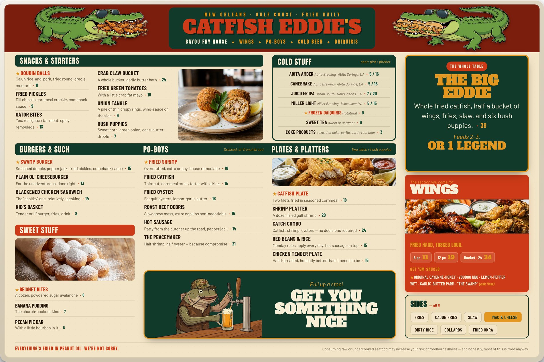
This one is a full original: a casual bayou fry-house built ground-up to show the studio works at the paper-towels-on-a-spool tier, not just the linen one. It looks like a big laminated sign that smells like a fryer, and that’s the point — the engineering is meant to be invisible.
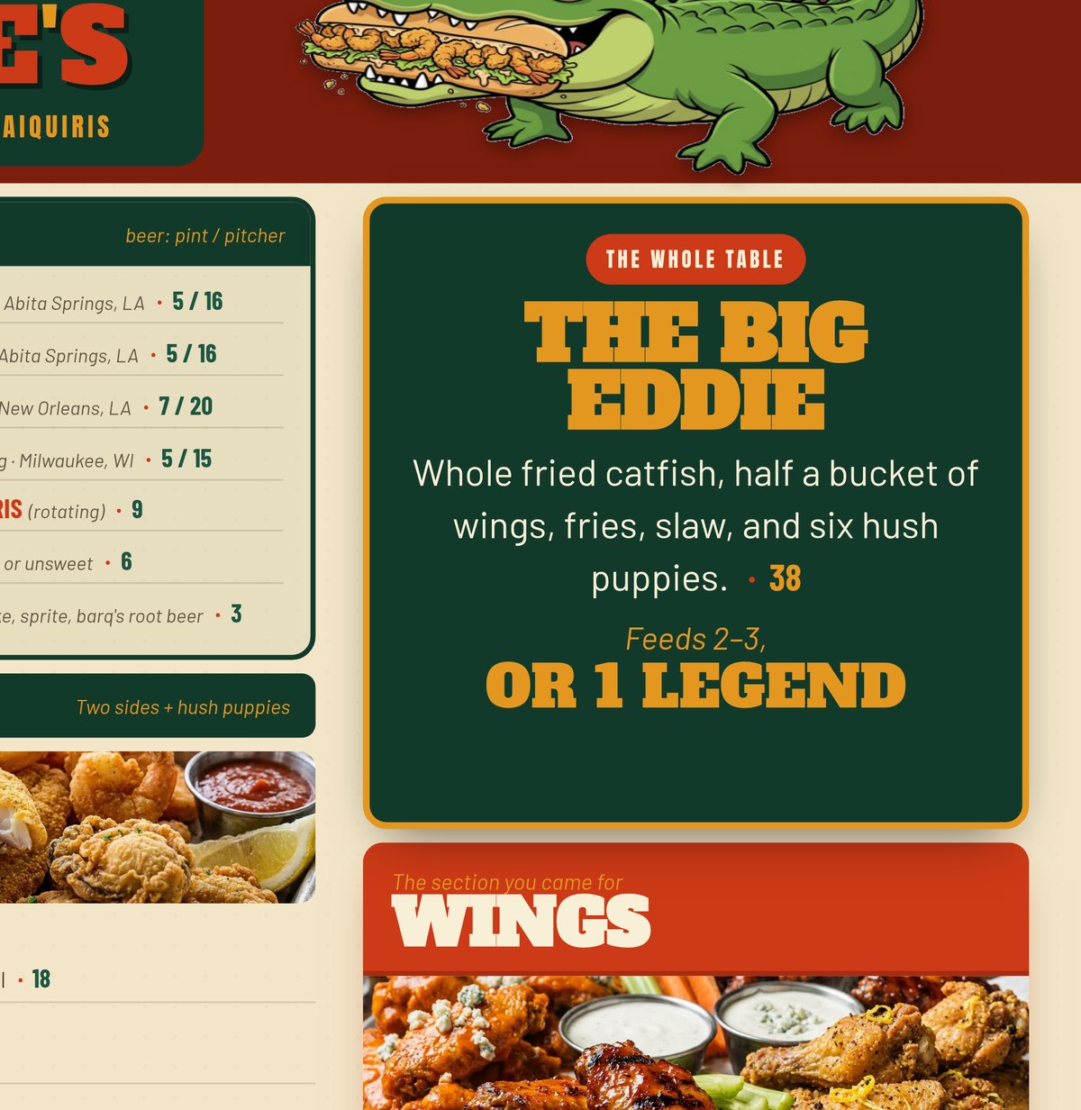
One hero photo per section, always sitting on the highest-margin item. Anchor dishes like THE BIG EDDIE at $38 that make a $16 po-boy feel easy. Whole-number prices with no dollar signs, sections capped around seven items, and descriptions that sell by being sensory and funny instead of fancy.
Here’s the part that matters: it scores 82 out of 100on the studio’s own public menu-scoring tool — the same tool that grades every visitor’s menu. The science isn’t a style. It works just as hard in a fry-house as it does in a dining room.
Mercer Seafood Co.
the re-engineering story
A demonstration build
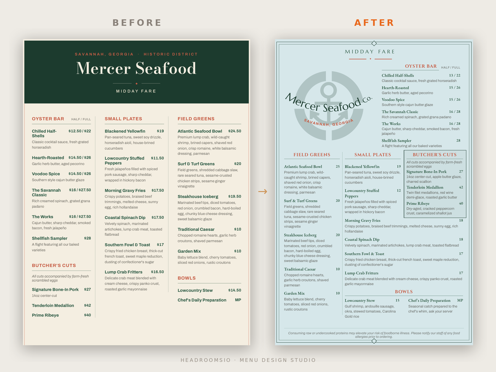
Mercer is the one where the guts do get rebuilt. Dollar signs removed, prices rounded up to clean whole numbers, real descriptions written for the highest-margin plates that were sitting there naked, and the butcher’s cuts boxed and moved up the page where they’d get seen. Same menu, re-engineered to steer the order.
Start with your own menu
Want to see where yours stands?
Score your menu free on the rater — it grades the same levers you just saw at work. When you want a person’s eyes on it, book a paid menu review and we’ll go through it together. Redesigns start at $1,500. Designed in New Orleans.