Before & After · Menu Redesign
Same kitchen. A menu built to move the plates that make money.
Mercer Seafood’s food was already good — the menu wasn’t working as hard as the kitchen. Here’s what changed in the redesign, and why each change nudges a guest toward the order that pays.
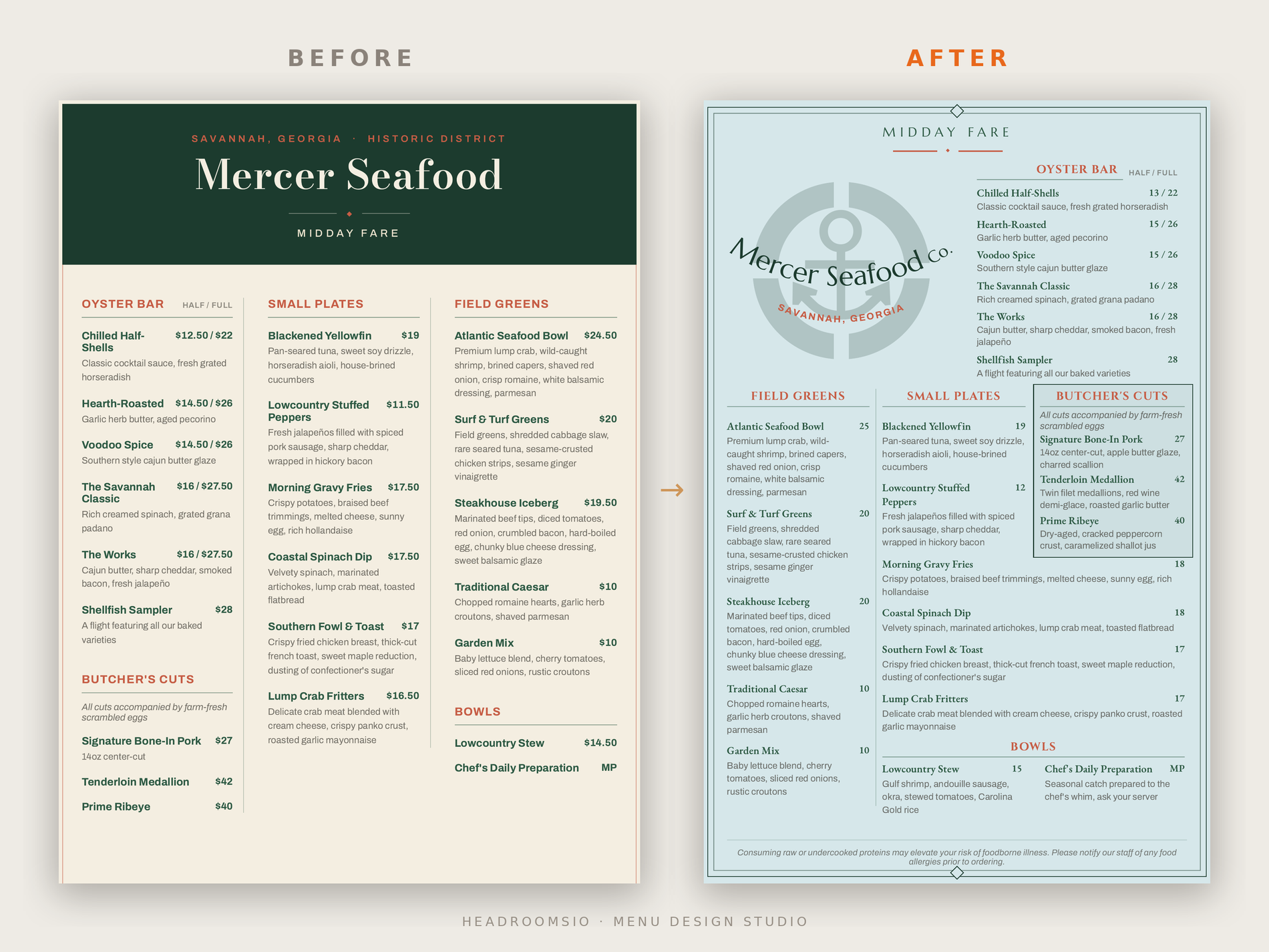
Where the original leaked money
the “before,” read the way a guest reads it
- Every price wore a dollar sign.The eye reads “$” as “spend,” and it lands before the food does — reminding a hungry guest to be careful with money at the exact moment you want them ordering.
- Charm pricing — $12.50, $19.50, $16.50. Cents-on-the-dollar reads like a clearance rack, not a seafood house. It quietly caps what the room feels comfortable spending.
- Prices in bold, lined up to scan.Set that way, guests compare numbers down the column instead of reading the food. You’ve turned the menu into a price list.
- The two highest-margin plates were buried. The $42 tenderloin and $40 ribeye sat in the bottom-left corner — the lowest-attention spot on the page — with no description. Just a name and a number.
- A heavy dark header ate the top third. The food starts low. The first thing a guest sees is a block of color, not something to order.
What changed, and why it sells
each move, and the reason behind it
- Pulled the dollar signs off every price.Menus that drop the “$” see guests spend around 8% more (Cornell). The number stays; the spending cue goes.
- Rounded every price up to a whole number($12.50 → 13, $19.50 → 20). Someone who’ll pay 13.50 pays 14 without blinking — so you round up, not to the nearest. It’s free margin, and it reads cleaner.
- Set each price beside its item and out of bold — no column left to scan. The guest reads the food, and the price sits quietly next to it, instead of shopping the cheapest line.
- Wrote real descriptions for the tenderloin, ribeye, and bone-in pork. “Dry-aged, cracked peppercorn crust, caramelized shallot jus” sells a steak. “Prime Ribeye — 40” doesn’t. Sensory, specific names sell a plate harder than a bare line ever will. Biggest change on the page — and it lives on the highest-margin plates.
- Boxed the Butcher’s Cuts and moved them up. People read a menu top to bottom, not in some magic triangle — so the high-ticket cuts belong high, not in a dead corner. The framed $42 and $40 also anchor the section: the mid-priced plates then feel easy.
- Lightened the page and added the anchor mark. The food breathes and the brand finally shows up. This part is the polish, not the lever — the selling is in the five moves above.
No fake numbers — just the mechanism
Mercer Seafood is a demonstration build, not a paying client — so there’s no sales figure to wave around, and I won’t invent one. What I’ll stand behind is the mechanism. Every move here is built on principles with the receipts to back them:
- ~8%more spend when menus drop the dollar signs (Cornell)
- Higherspend on plates given real, sensory descriptions than on bare list items
None of that requires a bigger kitchen or a higher food cost. It’s the same food, engineered to sell.
The reason I catch these things: fifteen years running restaurant floors, nearly every kind of place there is — neighborhood spots, breweries, hotels, fine dining. I’ve watched thousands of guests read a menu and decide in eight seconds. This redesign is that floor experience turned into design decisions.
Your menu, next
Want to see where your own menu leaks?
Start with the free menu score — upload yours and get it rated on the same principles used here, in a couple of minutes. If it turns up something worth fixing, book a menu review and I’ll go through your menu line by line: what’s working, what’s costing you, and exactly what to change.
See the full menu design portfolio → · Menu design in New Orleans →